Showing posts with label illustration. Show all posts

Thursday, December 12, 2024

2OLOTR - Mad Magazine Exhibit at The Norman Rockwell Museum


Two Old Ladies on the Road. Besides visiting Richard Widmark's grave in Roxbury, Connecticut, I wanted to visit the Norman Rockwell Museum in Stockbridge, Massachusetts. 

On our runaway trips, our pace is leisurely. If we want to do something, we do, but not necessarily at the crack of stupid. Per the Rockwell website, I purchased tickets online for a Monday visit. We figured all the Leaf Peepers would have gone home. So we had a leisurely morning and arrived at the museum around 11 AM only to find it was packed with Weebles (Elderly. Even though we are now in that category we're at the young end of the spectrum) Not only packed in the parking lot, but people were arriving by busloads! 

Teague found a place to park We were greeted by these whimsical sculptures by sculptor, Peter Rockwell, one of Rockwell's sons.


The day we visited there was also an exhibition What Me Worry? The Art and Humor of Mad Magazine.


Before Alfred E Newman became the face of Mad Magazine, there were earlier prototypes like Billy Riley for cigars


and these characters selling World War II War Bonds


Alfred E Newman, the man, himself.


My dad was a voracious reader, but he didn't like us to read comic books. They were verboten especially Mad Magazine. That didn't stop The Brother from bringing them into the house and letting me look at them even though at the age of 8 or so (The Brother is 6 years my senior), I didn't really understand a lot of the magazine. . So wandering around the exhibit gave me the same feeling of doing something I wasn't supposed to. Sorry, Dad.


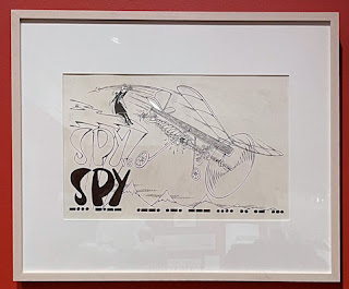
The height of the Cold War brought us Spy Vs Spy. This was my favorite. I hope you'll be able to embiggen the images to read text.


Son of Mad


The Headless Horseman


A rather unflattering satire of The Girl with a Pearl


Scully and Muldar from The X-Files as American Gothic


Famous Aliens


Tuesday, October 29, 2024

T Stands for Self Portraits


Teague and I visited the Norman Rockwell Museum in Stockbridge, Massachusetts last weekend. We saw Rockwell's iconic self-portrait. Notice the glass on the wicker chair which holds the mirror. Paint water or a beverage? You decide.


Besides Rockwell's art there was also a special exhibit going. What Me Worry? The Art and Humor of MAD Magazine. Alfred E. Newman Triple Self-Portrait, 2002, Richard Williams. From the museum description of the painting: An admirer of Norman Rockwell and the chief appropriator of his work for MAD, Richard Williams put a twist on Triple Self-Portrait, the artist's 1960 cover illustration for The Saturday Evening Post and My Adventures As An Illustrator, his autobiography, Alfred E. Newman takes Rockwell's seat at the easel..."

Can you spot the things that are the same and the things that are different?

Drop by hosts, Bleubeard and Elizabeth's blog to find out what the rest of the T Stands For gang is up to. If you want to play, include in your Tuesday post a beverage or container for a beverage. Don't forget to link your blog to Bleubeard and Elizabeth's page.

Monday, July 19, 2021

Sunflowers


Sunflower study for an upcoming project I want to work on. The piece was done in my Workshops journal using drawing/painting techniques taught by Kathy Milici in the The Prayer of St. Francis workshop at the Sacred Art Institute on Enders Island (Connecticut) in 2019.

Pigma pen, Kuretaki Gansai Tambi watercolors, #2 pencil on Canson Mixed Media paper.

Monday, June 21, 2021

Workshop Week: How to Draw Any Flower


This workshop taught by Shayda Campbell was a lot of fun. She broke down  drawing flowers (daisy, marigold, and lily of the valley) into steps which were very easy to follow. She used simple materials: a pencil for drawing a rough and a thin and thick line permanent marker such as the Micron Pigma pen. The larger or thicker to outline and the thinner or smaller to add detail. I completed this workshop in my Canson Mixed Media journal which is on a 90 lb. paper. She used a size .04 and a .02 Micron. I didn't have a .04 (or couldn't find it) so I used a .03 and a .01.

Shayda also had a larger project to complete illustrating all 12 birth month flowers to be used as the illustration for a wall calendar. She provided free calendar sheets to download. I wasn't interested in this part of the project.

Tuesday, November 6, 2018

T Stands for Sculpting

I met Scott Nelson at the WAM Open House. Our show and tell tables were next to each other, and we got to chat during a lull. Scott usually teaches youth classes, but this term he was teaching The Art of Humorous Illustration to adult.

Scott mentioned besides covering drawing and illustration, his class would also cover some marketing tips. Sounded good to me and as I had some free time, I thought it would be fun to be a student. Drawing would also give me a chance to expand my horizons and keep me on task with Inktober.

Class begins with some sort of warm-up: 30 second figure drawing, 2 min. figure drawing with watercolor, cartooning (it's hard to be funny on the spot) , and during the last class sculpting.

Scott gave each student a lump of clay. We were to sculpt a figure that we would be able to use as a model for a card, cartoon, or storyboard for a book.

The beginning of class is always scary for me. I feel the Prissy butterflies flutter into my throat.


Silly, I know. It's good to be out of your comfort zone. Take a deep breath. Scott tells us to draw or write what you know. What do I know? I know letters. And as a crazy cat lady, I know cats.

So I take my lump of clay and begin pressing and shaping it. 


And soon a little cat shape appears. There's my travel mug filled with English Breakfast tea that I bring to class.


I used a sculpting tool to shape the clay. The room was chilly and my hands were cold so working with the modeling clay was difficult. It's not as pliable as the play dough I used to make when the girlies were little.

I turned my travel mug around so the cat face would show on the mug cozy. Crazy, cat lady.


As Ink began to take shape, I relaxed and got so busy in class with finishing the sculpture and working on a story board, I forgot to take profile views of the kitty.


So, took them when I got home.

Drop by hosts, Bleubeard and Elizabeth's blog to find out what the rest of the T Stands For gang is up to. If you want to play, include in your Tuesday post a beverage or container for a beverage. Don't forget to link your blog to Bleubeard and Elizabeth's page.

Monday, October 15, 2018

Inktober Monday

Drawings for the second week of Inktober


 10/08 Inktober prompt: Star and another Celtic knot


10/09 Inktober prompt: Precious. My precious. Drawing hands is hard and the ring looks more like a cereal ring. It's gilded with variegated gold.


10/10 Inktober prompt: Flowing Chibi mermaid has flowing hair.


10/11 Inktober prompt: Cruel, but I chose to interpret it as Crewel as a type of embroidery. The thistle is colored with Pigma pens and Tombow markers

10/12 Inktober prompt: Whale. This is a little fellow I used to doodle when I was a kid.


10/13 Inktober prompt: Guarded


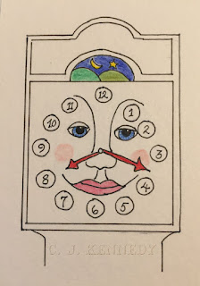
10/14 Inktober prompt: clock From my childhood, Captain Kangaroo's Grandfather clock

Monday, October 8, 2018

Inktober Monday

These are my creations for the first week of Inktober.


10/01 Inspired by the recent Celtic Knotwork class I took, I thought I'd try weaving a triquetra as I had trouble with the concept in the class. I thought it would be fun to turn the triquetra into a snake eating its own tail. I wasn't planning on using the prompt for the day: poisonous. I suppose this could fit the prompt though the snake doesn't look very intimidating.


10/02 I'm taking a class in illustration. In class, I had colored Ink with colored pencil, but couldn't seem to get any depth of shading. This experiment was done with watercolor pencils, and I like the effect much better. This also gave me an idea for a Christmas card. Though I wasn't following the prompt for the day: tranquil. This pose of Ink fits.


10/03 I didn't use the prompt for the day: roasted for this Zentangle.


10/04 Challenge prompt: Spell    May those who love us, love us. May those who do not love us, may God turn their heart. If He does not turn their heart may He turn their ankle so we will know them by their limping.


10/05 Challenge prompt: Chicken


10/06 I wasn't going to follow the challenge prompt Drooling. Saw Corolla munching the grass outside the sun room. I suppose Corolla could be drooling at the thought of all the delicious grass in the yard.


10/07 Challenge prompt: exhausted. Concordia's flower is spent, and the peace lily looks exhausted.


Tuesday, April 17, 2018

T Stands For Baby G

Baby G's due date was 4. April, but a due date is a best guesstimate. First babies are usually "late" though babies arrive on their own schedule. Baby G was no exception. She arrived on Thursday, 12. April at 3:18 PM. tipping the scales at 7 pounds 1 ounce and 20.5 inches in length.

While the rest of the family were no doubt pestering inquiring of the mom-to-be when the baby was arriving, I was working on this piece for Baby G's room. Rather like Baby G, it occurred to me too late to take process photos. This is at the very end.

Baby G's room has a nautical theme with whales. The room is painted a pinky purple or a purpley pink. I thought a mermaid in a Chibi anime-style would be cute. So at this point, the drawing, lettering, gilded boxed initial in 23K gold, starfish in her hair painted with shell gold is done.

I used a purpley pink color in gouache for the background of the boxed initial. Gouache is an opaque watercolor and stands out nicely against the gold gilding.

I wanted a softer aspect to the mermaid so used watercolor pencils. Her fins have been washed with Schminke silver watercolor because a girl can't have too much bling.

You won't see a beverage as I've been known to dip my brush in tea or spill it all over the desk. There's a reason Ma didn't name me Grace. On my desk you can see two, small, plastic cups. One with dirty paint water and one with clean, distilled water along with distilled water in a dropper bottle.

Since the background of the boxed initial is colored, it needs something so it doesn't appear so flat, Traditionally, white work, (doodles painted with white) would be done. And I did, but the traditional designs looked wrong for such a whimsical picture. I painted over and decided to add simple, white dots.

My brush work for such fine work isn't that great. My brush dots tend to look more like commas so I use the end of a small, ball embosser. That's the white tool resting on the brush rest next to my brush.

For the white, I use Chinese white, a very opaque white, recommended by Valerie Weilmuesnter when I took her Illumination class 3 years ago at the Sacred Art Institute on Enders Island in Mystic, Connecticut.

The final embellishment to the piece is a small, (costume) diamond (April birth stone) earring. I broke the back off and sanded off the nub so the fitting will stand flat. I wondered what glue to use and asked the question on Facebook. Jacqueline Sullivan, a calligrapher who does a lot of work with metals, advised using Crafter's Pick Ultimate Glue. I had the pleasure of taking a workshop from Jacqueline many years ago. I ordered the glue and am waiting for its arrival.

After the gluing all that's left is to mat and frame.

Drop by hosts, Bleubeard and Elizabeth's blog to find out what the rest of the T Stands For gang is up to. If you want to play, include in your Tuesday post a beverage or container for a beverage. Don't forget to link your blog to Bleubeard and Elizabeth's page.


Saturday, March 5, 2016

Graceful Envelope Entry

For better or worse, I mailed my Graceful Envelope entry on Thursday, a week ago. I thought the deadline was the last day of February. I was mistaken. Entries must be postmarked by 28. March 2016. There's still plenty of time to enter. This year's theme is Communication.

Now comes the hard part, the waiting. You're not notified if your envelope made it to the destination. Though I mailed a "diaper" for the 2000 contest, and it arrived in perfect condition.  I have faith in the USPS. Besides, S. at my local post office carefully hand-cancelled the four stamps I used. She's my good luck charm.

Judging takes place in April and contestants will be notified in June.

Monday, February 1, 2016

Colouring Book Project.

The Bodleian Libraries at the University of Oxford is running a coloring, pardon me, colouring project for the first 5 days of February. Go here to download the free coloring book full of illustrations from their collection.

Print the book and have fun. The Library asks you share your drawings on Twitter from February 1 to February 5. Use the hashtag #ColorOurCollections and @bodleianlibs in your Tweet.

If the coloring book illustrations don't float your boat, the Library suggests you search their collection and print out illustrations that are more appealing to you.

I printed the coloring pages on Diploma Parchment, a lovely paper that takes ink and paint well.  I'm going to use this project as a personal challenge through the entire month.

Thursday, December 25, 2014

Throwback Thursday

The first calligraphic Christmas card I made. Calligraphy, illustration, and signatures scanned into the computer and printed on cardstock. Christmas star and horizon hand painted.  1996

So from my home to yours, Merry Thanksgivaweenakahzayule and Happy Thursday!

Tuesday, April 22, 2014

Is There A Difference?


I was asked what's the difference between a Zentangle and a Zenspiration.

The black and white image is a Zentangle. The art form was developed by Maria Thomas and Rick Roberts. The process involves being mindful to reach a meditative state as you draw "one stroke at a time". The tangles (the terms for the patterns) are made on a 3.5 inch square of paper referred to as a tile. The tile begins with a light pencil line called a string randomly drawn on the tile. The string is the framework where you draw the patterns in or outside of the string as the mood strikes. The patterns are drawn with a .01 Micron Pigma pen. You don't pencil your pattern first then go over it with the pen. There is no erasing. The pencil is also used to lightly shade the patterns to create depth. While color can be added, the pure form is black and white. There is also a 12 step philosophy to get into the zone. The process is easy to learn, portable, and addictive. For more information visit Zentangle.com

The second creation comes from the imagination of Joanne Fink and is one of her Zenspirations called Dangles. Dangles remind me of whimsical windchimes or beaded, hippie curtains. There are no special papers or pens to use. The dangles hang from rods (like a curtain) and are filled with doodles which are then colored in using pens, colored pencils or whatever media your heart desires.

Joanne's patterns aren't limited to the dangles. She creates double stroked figures such as birds, bird cages, flowers, and doodles in the spaces created by the double lines. She also created a double stroked alphabet to add words and inspirational messages. The method is easy to learn, less rules to follow, and also addictive. To learn more visit Zenspirations.